Every so often we take a few minutes to check out a business that is actually using an automated sales system.
We enter the sales funnel just like any other person who comes across their site; however, we examine everything and share our thoughts on how to make it even better!
This examination features D1 Sports Training of Huntsville, AL.
If you have no idea what an automated sales system is – click here.
First and Foremost
I must commend D1 Sports Training for actually having an automated sales system.
I examined 17 other gyms, fitness centers, and sports training centers in the Huntsville, AL area and D1 was in the minority. Only about 25% of these businesses had implemented some kind of automated sales system.
In all of my examination and research thus far, the gym industry does a much better job at implementing automated sales system than any other industry. For example; in the car dealership industry – out of 19 dealerships I looked at, only 1 had an automated sales system.
Their Site

While I’m more concerned about the actual automated sales system, I must address the website because it’s part of the whole experience.
When I first came upon their website – I was impressed.
It is a nice, professional, website; albeit, it is not mobile responsive, which is something I highly recommend changing.
It looks tough and rugged too, just like they train you to be.
While the D1 brand has multiple locations (27) across the country, and therefore, I’d imagine, a pretty decent revenue in order to invest a lot of money into a beautiful website – it really doesn’t have to cost too much.
We at Crazy Eye Marketing will get you up and running with a beautiful website at a price that you choose.
So, if your business website is old, outdated, not mobile friendly, sloppy, and/or ugly – contact us!
… sorry, we’re a business, I had to throw in a pitch somewhere 😉
Back to the examination!
The best part about their site is they have “Free Trial – Sign Up Now” button, and the entry point to a sales funnel, smack dab in the middle of their homepage!
This is outstanding!
The only thing I might change (or at least test) in regards to that button; are the colors of it. It almost blends in too well with the rest of their site. Don’t get me wrong, it’s certainly visually appealing – but, does it draw my attention?
I would test a bright green or a baby blue button in there to see what happens. Sure, it might not look as “cool”; however, the thing that matters is its ability to capture leads.
After clicking that button, we’re presented with the …
The Opt-in

A nice little popup appears asking us for our “Athlete Profile”.
Problems with Popups
There are a few problems with this popup method.
It does require JavaScript – so, if a visitor does not have Javascript enabled – the box will not appear. Fortunately, this is not too big of a deal these days as the web runs on JavaScript and the likelihood that someone has it turned off is slim to none.
The other issue that may arise in regards to having a popup box is how it displays on a mobile device. This one happens to display fine on my Samsung Galaxy S5; however, there may be phones out there where this opt-in doesn't display properly. This is something to be aware of and to keep an eye on.
Instead of having the popup, they could have another page dedicated to collecting the contact information.
Too Much Information
With an opt-in form, you want to request the least amount of acceptable information as possible.
The more information that is requested, the more of a “hassle” it is to fill out the form and it creates a barrier to entry.
For example; if I’m on my phone, typing in all of that requested information will take me a minute or two. I might not feel like spending my time on that.
Instead, request what’s needed in order to start the conversation.
In this instance, I believe D1 should ask for the first name, email, possibly the phone number, and possibly the age (this will allow them to send tailored content specific to that individual – but, only collect this if it’s being used to send tailored content. NEVER ask for extra information just to have extra information. Only ask for what you absolutely need in order to start the conversation.)
I doubt D1 needs to know the athlete’s last name, parent’s name, and zip code in order to get them in the door.
To summarize – I would scrap at least half of those data fields and only go with what is absolutely necessary to start the conversation. The rest of the information can be gathered when the athlete walks through the door.
Submit Button
Ewww.
Never, ever, have a submit button that says, “Submit”. That’s one of the biggest no-no’s in the industry!
The submit button should reaffirm exactly what the person is signing up for.
For example, “Get Free Trial!” or “Send Me My Trial!”
I would change this ASAP.
Lead Magnet
Let’s take a minute to dissect their Lead Magnet – “Sign Up For Your Free Trial”.
I love it.
I don’t believe there can be a better lead magnet than a free trial membership to a gym.
By my own personal experience, I've done a number of free trials to gyms, and they've converted me into a paying customer on multiple occasions.
In fact, I've only ever signed up for a gym if they've had a free trial. So, in my opinion, all gyms need to offer a free trial.
Nothing to change in regards to the lead magnet.
Upon Submission
After inputting all of my information and hitting the horrible “Submit” button – I was greeted with the “Thank You” page:

It’s not bad, but it should reiterate the reason I bothered to enter my contact information in the first place – the free trial.
At the very minimum, I would change the last sentence to say: “A D1 team member will be contacting you shortly in regards to your Free Trial!”
Also, on the thank you page, I would add some links to more information or the social media pages. Say something along the lines of “While you wait for your free trial to arrive in your inbox, why don’t you check out these articles or like us on Facebook, Twitter, Instagram, etc.”
I’m Concerned
The message has not been consistent across the entire opt-in process.
By keeping the message of the “free trial” consistent, you build trust; however, with the exception of the initial free trail button on the homepage, I haven’t seen anything else talking about my free trial – whether on the opt-in form, nor the thank you page, and I’m becoming a little concerned that I'll actually be getting a free trial.
You need to keep the message consistent, because, right now, I can’t really remember what I signed up for.
Rapport Building
3 hours and 41 minutes after submitting my information in order to get a free trial, I received an email.
Yes, after submitting my very personal information like my full name, age, my parent’s name, my email, my phone number, and my zip code – information I hold dear – I heard nothing for 3 hours and 41 minutes.
This is unsatisfactory on multiple levels.
At the very least, I need an instant email confirmation saying that you received my personal information and that you’ll be in touch shortly.
I need to know that all of my contact information is both valued and being handled properly.
3 hours and 41 minutes of silence does not convey that you really care about my information.
Issue number 2, after 3 hours and 41 minutes, I may have even forgotten about you guys. More than likely I’m searching for several gyms that offer free trial memberships, and if you don’t respond, I’ll just go on to the next one, and you will miss out on me becoming a paying member.
3 hours and 41 minutes later …
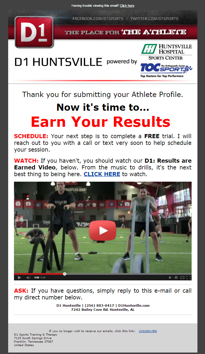
All in all, I think it’s a pretty good first email.
First, it’s attractive and looks professional.
Second, it tells me what’s about to happen – that someone will contact me in regards to my free trial.
Third, it tells me what to do in the meantime – watch this awesome video.
Fourth, it tells me what to do if I have any questions – hit reply or call.
All in all, pretty good.
The biggest issue I have is that I had to wait 3 hours and 41 minutes to see it. Why wasn't it sent instantly?
I would also add a signature block to the email. You say to call, but who am I to ask for?
2 hours and 34 minutes later …
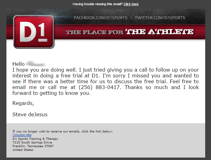
Nice!
A follow up email!
Short, sweet, to the point!
I like it, I love it, I want some more of it!
17 days later
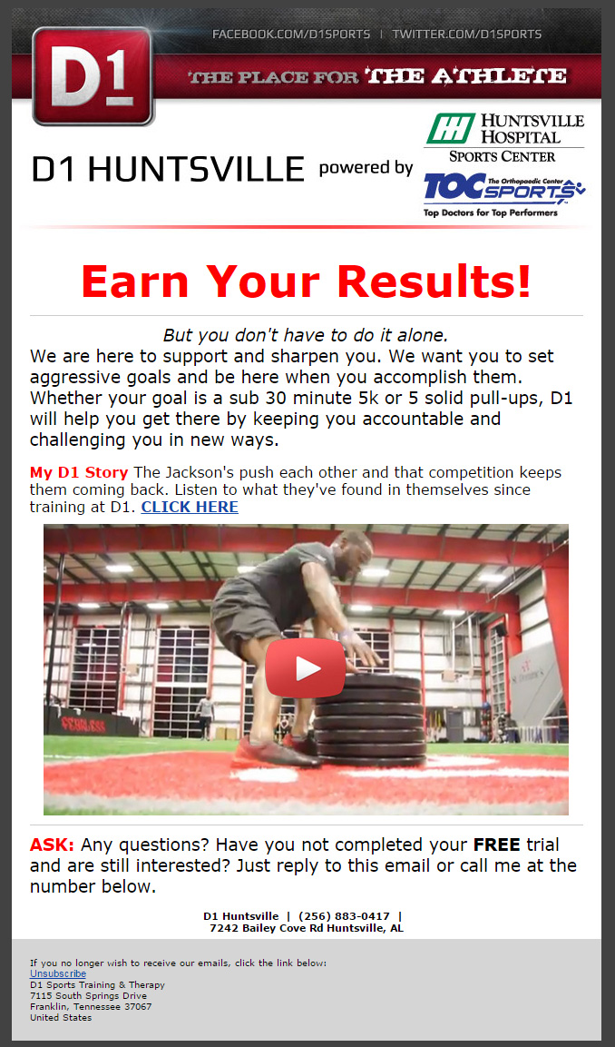
I don’t understand why this email followed 17 days later.
By this time, if I've not already signed up for your gym – I've forgotten you exist and am already happy elsewhere.
When in the rapport building phase of the sales funnel, time is of the essence. You need to be proactive and responsive, working to build that relationship as quickly as possible in order to get that individual through the door and converted into a paying customer.
However, with the exception of the 17 day delay, it’s a great second (or third, depending how you look at it) email. It shares a story of someone who’s had success within your gym – and people love success stories.
I can’t tell from this exact email, but hopefully you’re using the age information I inserted in order to share a story with someone in my age group.
For example; if I selected that I was in middle school, I should receive a story about a middle schooler who found success with your gym.
When I registered, I selected that I was an adult – and this story is about an adult, but, I don’t know if this is just a coincidence or if I was specifically targeted.
Remember, if you’re not using the information you requested upon initial sign-up – don’t collect it.
Also, I would be sure to add a signature block to the email so the individual receiving the email knows exactly who to ask for when they call.
Summary of What They Need To Do:
- Their site is “pretty” – however, it is not mobile responsive. It still looks fine and functions on mobile devices; however, it’s not “meant” for mobile devices. I would change this.
- They should test their “Free Trial” button that is on the homepage. Try different colors that standout more and see how well they convert.
- They need to re-evaluate exactly what fields they’re using in their opt-in. If they are not using the information they’re asking for, or if that information can be gathered later – don’t’ ask for it right up front. It needs to be as simple as possible to fill out.
- The popup opt-in is “cool” however, some mobile devices may not support it. I’d recommend setting up a separate page specifically to collect leads.
- They need to change their “Submit” button ASAP – to anything other than “Submit”.
- They need to re-iterate on their thank you page that the individual will be receiving a free trial membership shortly. The message needs to be kept the same across all steps of the opt-in process.
- They need to send a confirmation email IMMEDIATELY after someone sends in their personal contact information. No one likes the thought of their information floating around out there in cyberspace.
- They’re emails were actually good for the most part. The biggest issue was their timing. The first one should be instant, the second one was appropriate, and the third one was 17 days later – which is way too long.
- They should also add a signature block to their emails.
Conclusion
At the end of the day, D1 Sports Training is doing a pretty decent job.
The biggest issue they need to fix is the timing of their email delivery – which can be accomplished with a few clicks.
The rest of the issues are fairly small and easy as well; however, when compounded will have a huge impact on conversion rates.
What Do You Think?
I need to know if you've found this post helpful in any way.
Even if you don't own a gym or a fitness center, does it help you understand how to approach an automated sales system?
What would make this post better?
Leave a comment below!